

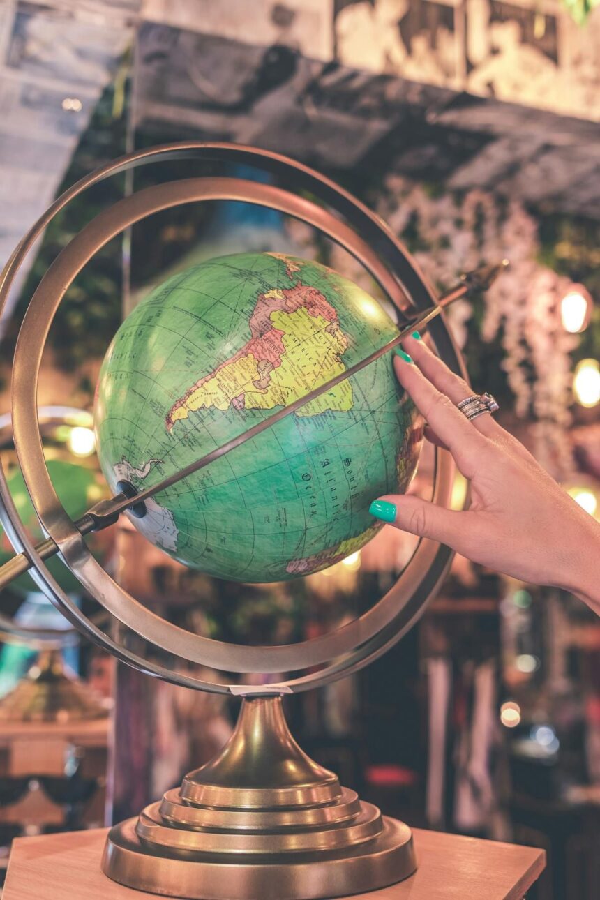
Africa’s population reached one billion in 2008. It is already 1.5 billion, and it is going up at a steady 35 million a year. Photo by Artem Beliakin • Unsplash /Artem Beliakin • UnsplashArticle contentTwo Africa-based advocacy groups, ‘Africa No Filter’ and ‘Speak Up Africa’, launched a “Change the Map” campaign in April.THIS CONTENT IS RESERVED FOR SUBSCRIBERS ONLY.Subscribe now to access this story and more:Unlimited access to the website and appExclusive access to premium content, newsletters and podcastsFull access to the e-Edition app, an electronic replica of the print edition that you can share, download and comment onEnjoy insights and behind-the-scenes analysis from our award-winning journalistsSupport local journalists and the next generation of journalistsSUBSCRIBE TO UNLOCK MORE ARTICLES.Subscribe or sign in to your account to continue your reading experience.Unlimited access to the website and appExclusive access to premium content, newsletters and podcastsFull access to the e-Edition app, an electronic replica of the print edition that you can share, download and comment onEnjoy insights and behind-the-scenes analysis from our award-winning journalistsSupport local journalists and the next generation of journalistsRegister to unlock more articles.Create an account or sign in to continue your reading experience.Access additional stories every monthShare your thoughts and join the conversation in our commenting communityGet email updates from your favourite authorsSign In or Create an AccountorArticle contentArticle contentArticle content“When whole generations, in Africa and elsewhere, learn from a distorted map, they develop a biased view of Africa’s role in the world,” said ‘Speak Up’ founder Fara Ndiaye – but hardly anybody outside Africa noticed.Article contentArticle contentThat may be changing, because earlier this month the 55-member African Union endorsed the campaign, making it a diplomatic issue as well. The claim is that the traditional Mercator map of the world shows the African continent as hardly any bigger than Europe, whereas in reality it is at least four times as big.Article contentArticle contentArticle contentThat’s all very well, and it’s true that Mercator’s map projection dates from the 16th century, when European ocean-going ships were expanding and transforming everybody’s view of the world.Article contentArticle contentCHOOSE YOUR POISONArticle contentArticle contentBut it’s also true that all flat maps distort the surface of a sphere (like the Earth) one way or another. Choose your poison, but you can’t have it all.Article contentArticle contentGo with the Mercator map and all the continents and islands retain their real shapes – but the further north or south of the equator they are, the bigger they look compared to countries near the equator. You can fit 14 Africas into Greenland.Article contentArticle contentGo with the ‘equal areas’ map (designed in 2018), and it’s the actual shape of the continents that is distorted – but you do get a clear idea of how big they are compared to each other. Horses for courses, you might say, and you can easily see why contemporary Africans would prefer the ‘Equal Areas’ map: it makes them look more important.Article contentArticle contentArticle contentLONGITUDE AND LATITUDEArticle contentArticle contentBut there was a good reason for the Mercator map too. It wasn’t to make Africa look small and insignificant, as some paranoid ‘anti-colonial’ rhetoric alleges. It was because if you drew a straight east-west line on a Mercator map, it would lead your ship safely to its destination (barring hurricanes, pirates and mutiny).Article contentArticle contentEarly mariners had no way to figure out how far east or west they were (longitude), but as long as they could see the Sun or the Moon they could figure out how far north or south they were (latitude).Article contentArticle contentThey would therefore sail east or west along the line of latitude that passed through their destination, guessing how close they were to it by keeping track of their speed (throw a log over the side and see how fast you pass it) and hoping they would not reach the coast in the dark in the middle of a storm.Article contentArticle contentThat’s what the Mercator projection was for. Nobody cared how big or small the destination looked on the map; they just needed to know what the right latitude was. All of that is irrelevant to modern navigation, so people can now safely fiddle with the size or shape of countries on the map according to taste.
GWYNNE DYER: Map change campaign in Africa not enough


